NEWSPAPER DESIGN CONCEPTS
LEARNING OBJECTIVE: Detail the design concepts used in ship or station newspaper makeup.
Successfully designing a newspaper page encompasses more than experimentation. It is actually a calculated art evidenced by the following five newspaper design concepts:
. Balance l Contrast
. Rhythm l unity l Harmony
BALANCE
In the balance concept, the page designer (hereafter referred to as the editor, although it may be any member of the newspaper staff performing this function) tries to balance heads against heads, pictures against pictures, stories against stories and artwork against artwork. This balance, however, is a relative balance, and it is not measurable but is something gauged in the viewer's mind. Therefore, the editor has to sense, rather than measure, the balance for a page. This perception is one
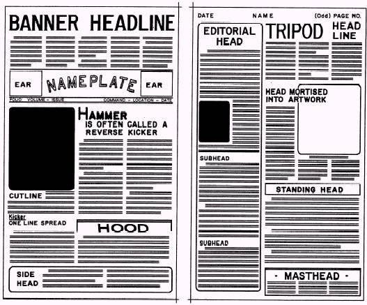
Figure 8-18. - Individual components of newspaper makeup.
developed by experience. The editor looks at the page
CONTRAST
In the contrast concept, the editor strives to separate display items on the page so each gets the attention it deserves. The editor uses type, headlines, pictures, white space and color to achieve contrast.
For example, the editor can achieve contrast with type by using regular type with boldface type. Headlines also can be contrasted by using bold, blackheads or by displaying reman type with italic type. The editor can achieve contrast with pictures by using verticals with horizontals, small column widths with large column widths or dark and light photographs. Further, the editor can achieve contrast through color by displaying black type with color boxes, pictures and heads.
RHYTHM
By using the rhythm concept, the editor tries to get the reader to move from one element to another element on the page. Rhythm is achieved in newspaper makeup by staggering headlines, stories and pictures on the page.
UNITY
The unity concept of newspaper makeup is used to tie the page together; therefore, the page is not divided into one, two or more sections. A page that lacks unity is called a paneled page. You can avoid paneled pages by crossing the column gutters (space between columns) with headlines and pictures in the middle areas of the page.
HARMONY
The harmony concept is used to give a newspaper a standard appearance from day to day. Harmony generally refers to typographic harmony. This means using one typeface for body type and a contrasting typeface for cutlines. Headlines should have the same typeface as the body type and maybe varied by weight and the use of italics on occasion.
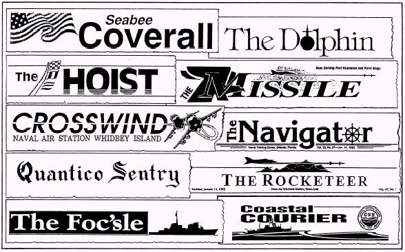
Figure 8-19. - Newspaper nameplates.
ELEMENTS OF NEWSPAPER MAKEUP
LEARNING OBJECTIVE: Identify the individual elements used in ship or station newspaper makeup.
Thus far, all the subject matter in this chapter has dealt with the tools and materials available for presenting the reader of a ship or station newspaper with an attractive, interesting and convenient look at the news. Whether you achieve the desired product will depend on how these tools and materials are used in assembling your newspaper.
If you are the person responsible for laying out, making up or actually pasting up your newspaper, you should adopt a basic typographic plan or style. First, read all of the copy being considered for the newspaper. Study the pictures and other artwork closely. Visualize the news story message, or ideas, and the nature of the artwork as a whole. Decide the relative importance of the elements; then put the entire page together using the individual components of newspaper makeup (fig. 8-18).
Makeup creates recognition of a newspaper. A good editor varies the makeup in each issue, so the readers are not bored with the newspaper. on the other hand, each page will resemble the previous editions enough so the reader can immediately identify it.
The following components help the reader identify a newspaper: l Nameplate l Flags l Masthead
. Headlines
l Pictures
l Whites, grays and blacks
. Rules
NAMEPLATE
The nameplate should be simple in design, attractive, and in harmony with the character of the paper. Its type should either harmonize or contrast with the headline type. The nameplate can combine type and artwork together. The artwork however, should not make the nameplate jumbled and hard to read. Figure 8-19 shows several examples of nameplates.
The nameplate can be made to float on the page. Although a nameplate that runs the entire width of the page can be made to float, a floating nameplate usually occupies two or three columns and is placed anywhere in the upper third of the page.
FLAGS
A flag of the newspaper is a display used by a newspaper to indicate section pages or special pages, such as editorial, sports and family pages. Just like nameplates, a flag should not dominate its page and should appear above the fold. Flags can also be floated. (NOTE: Some authorities maintain that a flag is the same as a nameplate and identify a section head as a "section logo." We do not.)
MASTHEAD
A masthead of the newspaper is often refereed to, incorrectly, as a nameplate. A masthead is a statement that should appear in every edition to give information about the publication.
The masthead of a CE or funded military newspaper includes the following elements:
l The name of the officer in command or head of the activity.
l The name of the newspaper and the producing command.
l The following statement: "The editorial content of this newspaper is prepared, edited and provided by the public affairs office of (command)."
l The name, rank or rate (if military) and editorial position on the newspaper staff of all personnel assigned newspaper production and editing duties. This is listed under the heading "(command) Editorial Staff."
l The following disclaimer: "This newspaper is an authorized publication for members of the military services (add the words "stationed overseas" "at sea" or "and their families" if applicable). Its contents do not necessarily reflect the official views of the U.S. Government, the Department of Defense or the U.S. Navy and do not imply endorsement thereof."
l The following disclaimer (for CE newspapers only): "The appearance of advertising in this newspaper, including inserts of supplements, does not constitute endorsement by the
Department of Defense, the U.S. Navy, (name of command) or (name of publisher) of the products and services advertised"
"Everything advertised in this newspaper shall be made available for purchase, use or patronage without regard to race, color, religion, gender, national origin, age, marital status, physical handicap, political affiliation or any other nonmerit factor of the purchaser, user or patron. If a violation or rejection of this equal opportunity policy by an advertiser is confirmed, the publisher shall refuse to print advertising from that source until the violation is corrected"
"Published by (name of publisher), a private firm in no way connected with the DoD or U.S. Navy, under exclusive contract with the U.S. Navy."
For second-class mailing, postal regulations require a masthead to be within the first five pages of the newspaper. These regulations also require that the masthead contain the following information: l Name of publication l Date of issue . Frequency of publication l Issue number l Subscription price (if applicable) l Name and address of the publisher l Second-class mailing imprint
The masthead of CE or funded newspapers must be printed in type not smaller than six point. Additional information on mastheads maybe found in PA Regs or Ship or Station Newspaper/Civilian Enterprise (CE) Publications, NAVPUBINST 5600.42 series.
HEADLINES
Headlines, or simply heads, contribute to all five concepts of newspaper design-balance, contrast, rhythm, unity and harmony.
The headline for one story should be separated from that of another. Heads that appear side by side (called 'Tombstones") could be read as one head and confuse the reader. Tombstoning also prevents each head from gaining its share of attention.
When headlines and pictures are used together, they should be placed so the reader is not confused by their positions. You should not place a picture between a headline and a story, because the reader might begin reading the cutline thinking it is the first paragraph of the story.
Heads of the same column width should not be placed lower on the page than a smaller one, or higher on the page than a larger one. This does not mean that the bottom of the page cannot contain a large multicolumn head. It only means that heads of the same width should decrease in point size as they descend the page.
Do not run stories out from under their heads. This creates a readability problem by confusing the reader about where to find and finish reading the rest of the story.
A story can be wrapped (to continue a story from one column to the next) under its main head, or lead, to achieve variation. A story is always turned to the right from its main part. A turn running above the headline of the story could confuse the reader and cause the individual to abandon the item.
A story requiring a "jump," or continuation, to another page should be split in midsentence, never at a period of a paragraph. For example, "(Continued on page , col. ) will direct the reader adequately. The jumped portion should carry a brief head, or key word, taken from the main head to identify it as a continuation. The "jump head" should be keyed to the same type style and face, although it seldom will be in the same type size, as the original headline. Never jump a story on a hyphenated word, or carry over the last line of a paragraph.
PICTURES
Readability studies have shown that pictures are one of the most popular elements in a newspaper. For that reason alone, important pictures should be large and positioned in a manner that maximizes their display.
Pictures of two-column widths or more should be placed on a page so they stand or hang from something that gives them support. A picture can stand on a headline, another picture or the bottom of the page. A picture can hang from a headline, another picture or the top of the page. A picture of two-column widths or more should not float in copy, but a one-column-wide picture or smaller can float in copy.
Pictures and headlines that are not related should be separated by more than a rule, if the possibility exists that, when placed together, they are humorous or in bad taste.
Avoid any clashing items. For example, do not place an accident story next to a mortuary advertisement. (Discuss the placement of advertisements with your editor or the CE newspaper publisher.)
If you run two pictures, two boxes or a picture and a box side by side, except in cases where the subjects are related, they tend to cancel each other out. It is best to separate unrelated artwork with body type.
Reader's eyes have a tendency to follow the line of sight of people in pictures. Therefore, if people in a picture look off the page, readers will tend to look off the page. To prevent the reader from doing this, the main subjects in pictures should look straight ahead or into the page. This also holds true for pictures showing action. The motion should go toward the center of the page whenever possible. This reader tendency can be used to your advantage. The line of sight and motion can be used to guide the reader's eye through a page.
Try to avoid running pictures on the horizontal fold of a newspaper, because the area along the fold becomes distorted once the newspaper has been folded.
Do not give a picture more display space than it deserves, especially a "mug shot" (portrait-type, close-up photograph of an individual). Mug shots can float in copy, but it is best if they stand on or hang from something. If a mug shot floats, it is best to float it within a sentence in a paragraph. Mug shots should be accompanied by at least a name line for identification. By omitting the name line, the reader is forced into trying to identify the individual in the picture.
"Thumbnails" also are used in making up newspaper pages. The term refers to half-column mug shots. A thumbnail is best used when it looks into the story or directly out of the page. A name line, in most cases, should also be used with thumbnails.
WHITES, GRAYS AND BLACKS
A newspaper page is made up of varying degrees of whites, grays and blacks. Some pages may contain other colors. A good editor strives for relative balance of colors on a page and will not let any color dominate the page. You will not have any problems with white pages, black pages or any other colored pages; your concern is staying away from gray pages.
There are many ways to relieve grayness, or gray-out, which is created by large areas of body type. one way is to use multicolumn pictures to break up columns of type. Another way is to use thumbnail photographs.
Type also can be used effectively to relieve grayness. To breakup gray areas in a long story, you can set selected paragraphs in boldface type, if used sparingly. Another method of breaking up long gray stories is to use boldface subheads set about two points larger than your body type size. A third method of using type to break up grayness is to use boldface, all-cap lead-ins. This method is particularly effective in matter set in wider measures. In two-column matter, the first three to five words of the paragraph containing a lead-in can be set in boldface and all caps, and in one-column matter, the first one to three words of the paragraph can be set in boldface and all caps.
The paragraphs to be set in any of these boldfaced methods should be the paragraphs that introduce anew element into the story or ones that contain information of more than usual interest. Two paragraphs using the same boldfaced method should not be run side by side because they tend to cancel each other out. Note that the use of boldface type is not favored by the editors of contemporary newspapers as much as by the editors with traditional leanings. (More about traditional and contemporary designs will be presented later in this chapter.) "Modem" editors rely on the use of different design concepts to eliminate large gray areas on their pages and consequently have little use for boldface type, except possibly as subheads.
Other useful devices in breaking up grayness are initial letters (mentioned earlier in this chapter), kickers and hammerheads (covered in Chapter 9) and sandwiches.
A sandwich is a device for handling "reefers" (References to a related story on another page). It is a small, sideless box made with the same rule used for regular boxes. The reefer type in the sandwich should be set in boldface and not be indented. No headline is needed and it should be brief, containing not more than two or three lines.
The sandwich should be placed about 2 1/2 inches deep into the story. Presumably, this practice gives the reader enough time to become interested enough in the subject being addressed to want the related information being offered. The use of the sandwich assumes the reader will immediately turn to the related story, read it and then return to the original story and continue reading below the sandwich.
Special effects can be obtained with special art, such as boxes and ornaments (art borders around individual stories, announcements and ads or the entire page). These devices are also effective gray breakers but should be used sparingly, so their use does not create a cluttered effect. In using boxes, you can indent a story on all sides and use a box of white space all around the story. You can also indent on all sides of a story and then use a ruled box. Dingbats, once in vogue, are now considered old-fashioned and are shunned by modem editors. White space provides margins to frame your page. Side margins should be the same width, but bottom margins should be about one-fourth wider than your top margins to give your page a lifted look White space is also used to give breathing room around headlines and pictures in much the same manner as margins frame the page. However, you should make an effort to avoid the appearance of trapped white space. White space should run to the outside of the page.
RULES
Rules are commonly used typographic devices in newspaper makeup. Properly used, they separate unrelated items and unite related ones. The two types of rules used are the column rule and the cutoff rule.
Column Rule
The column rule is a vertical, thin line that runs from the top to the bottom of a newspaper page. Use the column rule to separate columns of type and to separate unrelated items, such as photographs and stories, from the rest of the page. Part of a column can be deleted to indicate that the items joined are related
Cutoff Rule
A cutoff rule is a horizontal, thin line that runs across one or more columns of a newspaper page, depending on the width of the items to be separated or united. A cutoff rule is used to separate unrelated items, such as boxes, photographs, multicolumn headlines and advertisements, from the rest of the page. A cutoff rule helps the reader's eye turn the corner from where a story ends in one column to where it begins in the next column, except when the story wraps from the bottom of a page. Then no cutoff rule is needed
ADDITIONAL MAKEUP CONSIDERATIONS
Newspapers have other elements that usually appear in each issue and other makeup devices that are used to design newspaper pages. Some of these are described in the following text.
Widows
Avoid having widows at the tops of columns. A widow is an incomplete line, as one that ends a paragraph. When there is a widow, carry two lines to the new column or page.
Wrapping Copy
When you wrap copy, wrap at least 1 inch of copy into the next column. That is approximately six lines of type. Studies have shown that anything less than an inch of copy lacks eye appeal.
When you wrap a story, split paragraphs at the bottom of the column, when possible, to indicate to the reader that the story continues in the next column.
Folio Line
A folio line is an identification line of the newspaper on each page. The folio line on the front page is different from those on inside pages, as described in the following sections.
FRONT-PAGE FOLIO LINE. -A front-page folio line joins the nameplate and consists of the volume number (the number of years the publication has been in print), the issue number (the number of issues published within the present year), command, location (city and state), and date of publication. It does not carry a page number and is usually separated from the flag by a border and a cutoff rule or by two cutoff rules.
INSIDE PAGE FOLIO LINE. -An inside page folio line generally runs at the top of each page. It also can run as part of a flag that appears on special pages or within the masthead on the editorial page. The inside page folio line consists of the publication date (left corner of the page), name of the newspaper (centered) and the page number (right corner of the page). An inside page folio line is normally separated from the rest of the page by a cutoff rule, but as you can see in figure 8-15, this is not a requirement.
PAGE PERSONALITY
The quality of the layout and makeup of the inside pages of your newspaper should receive the same attention as the front page of the newspaper. Readers should not be shortchanged once they leave the front page of a newspaper. Special pages, such as editorial, family and sports, should have their own personalities.
Editorial Page
The editorial page probably is the least read of all the inside pages. The reason can be attributed particularly to makeup. Most editorial pages are very
dull and very gray. A good editorial page should be as different in makeup from other inside pages as possible. Use pictures and artwork, white space, odd-column sets and other elements of makeup to give the editorial page its own special traits.
Family/Leisure Page
An appealing family/leisure page features delicate type, white space and artistic designs. Use large and dramatic pictures to complement articles on off-duty leisure activities.
Sports Page
An attractive sports page contains plenty of action pictures. Be sure to include masculine type, white space, odd-column sets and large, bold headlines to complement the flavor of this popular newspaper page.
Other Pages
Inside news and feature pages should be as attractive as front pages within the limitation of available space. Use pictures, white space, multicolumn heads, artistic designs and groupings of related news and features on these pages.


PICTURE STORY LAYOUT
LEARNING OBJECTIVE: Analyze the main points of a picture story layout.
The picture story layout (also addressed in Chapter 12) is a special challenge to a layout editor. A good picture story is a logical, well-organized, self-contained unit in which each part has a specific function.
The format used to layout the picture story depends on space limitations and what you, as the layout artist, consider the most attractive arrangement. With an imaginative photographer, the number of interesting picture stories your publication can produce are unlimited. once you have been provided with a variety of interesting, action-packed pictures suitable for reproduction, the layout is up to you. Let your experience and good judgment be your guide in determining the arrangement of pictures, headlines, cutlines, text and borders.
A good picture story layout (fig. 8-20) can add immeasurable y to the interest and attractiveness of your publication. Like feature stories, picture stories can be made up in advance and used as either regular attractions or to spice up occasional issues.
In the following text, we cover the major points of assembling a picture story.
NUMBER OF PICTURES
The number of pictures required to make up a picture story depends on the importance and complexity of the subject. However, an odd number of photographs should be used in a double-truck layout. The term double truck, also called a centerfold, is used for a two-page layout made up as one page, with the "gutter," or normal margin between the two pages, eliminated.
LEAD AND LAST PICTURE
The most important picture of any picture story is the one that opens the story-the lead picture. This picture has a double function. First, it must attract the reader's attention and make that person want to know more about the subject. For that reason it should be the largest in your picture story. Second, it must show the subject and theme of the story in a graphically interesting form.
Almost as important as the lead picture is the last picture. The closing picture should show the reader the significance of the subject to the storyline or theme.
BODY OF THE STORY
The body, which shows important scenes of the subject in action, must be varied and lively in visual rendition and presentation. To provide this variety and liveliness in a story, the photographer should start with a good script, excellent change of pace in coverage techniques and a quick eye for unexpected developments during actual shooting. By careful study of major picture magazines, photographers, as well as layout artists, can gain a great deal of insight into the type of pictures being used in picture story assignments.
PICTURE DIRECTION
Some photographs, because of their compositional direction, are natural right-hand or left-hand photographs. This means that the photograph is a natural to be used on the right or left side of a page, photo display or picture layout. Picture stories are viewed in the same manner in which we read, from left to right. Therefore, the lead photograph should be one that has the subject facing toward the viewer's right and the ending photograph facing toward the viewer's left. When possible, all lead and ending photographs should be taken twice: once with a left-hand direction and again with a right-hand direction. By duplicating these shots, you provide flexibility for layout. All photographs have direction: left, right, upward, downward, straight in or straight out of the page.
HEADLINES, CUTLINES AND TEXT
Headlines, cutlines and text have double functions. First, they give the reader facts that supplement the pictures editorially. Second, they serve graphically as elements of composition that contribute to the organization of the picture story.
PROOFREADING
LEARNING OBJECTIVE: Identify the purpose of proofreading newspaper galley proofs and recognize the standard proofreader's marks.
Proofreading is one of the final steps in the printing process (from the standpoint of the JO, not the publisher).
After the publisher has typeset your copy, you will receive the initial copies of your typeset stories. These copies are called "galley proofs," "galleys" or just plain "proofs." The galley proof name originated in the printing profession many years ago. Proofs of long rows
of type came direct from the "galleys," or trays, in which the type sits until makeup time at the printshop.
WORKING WITH GALLEY PROOFS
Your job is to read through the galley proofs-every word and every punctuation mark-to make sure there are no errors and that they conform to the original copy. If an error is found, it will be connected at the expense of the publisher (in a commercial printshop). However, the cost of any changes in the original copy must be borne by your command, since they result in extra work for the publisher.
In photo-offset printing, you are likely to be given the complete paste-ups of pages (publisher's reproducible, sometimes called repros) for proofreading. Proofreading is usually done by all members of the newspaper staff and printshop personnel. The reason is obvious; checking the content of your publication is part of your job.
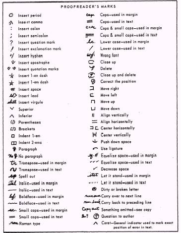
Figure 8-21. - Standard proofreader's marks.
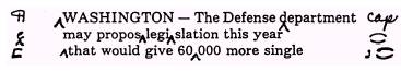
Figure 8-22. - Proofreader's marks using the book system.
PROOFREADER'S MARKS
Proofreader's marks (fig. 8-21) and copy editing marks are, for practical purposes, the same. The main difference is in their usage.
There are two popular methods of noting proofreader's marks on galley proofs: the "book" and "guideline" systems. Both systems are covered in the following text.
Book System
In using the book system (fig. 8-22), you make two marks to correct each error: one under the error and one in the margin. Place a caret (A) under the error. In the margin, place the appropriate proofreading symbol level with the line in which the error occurs.
Guideline System
In the guideline system (fig. 8-23), you place the appropriate proofreading symbol in the margin and draw a line from it to the error. This is the most common form of using proofreader's marks.
Check with your editor or associate editor to see , which proofreading method is preferred.
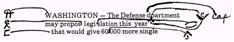
Figure 8-23. - Proofreader's marks using the guideline system.
WHAT HAPPENS AFTER PROOFREADING
After the corrections have been made and you have approved the galley proofs, the publisher takes and assembles type, along with photographs and other art, into pages according to the layout plan you submitted. From these, the publisher makes page proofs-and usually gives you a final chance to make sure there are no errors. Make sure headlines are with the proper stories, stories "jump" to the correct pages, paragraphs are in proper sequence and cutlines are under the correct photographs. Check the body type too. Sometimes a slug gets misplaced or jumbled, but routine typesetting errors should have been caught long before you reach this point. You will make a permanent enemy of the publisher if you start making unnecessary alterations.
After the final proofs are reviewed and approved, the publisher produces a "blueline" version of the newspaper for the editor to review. The blueline is a replica of the newspaper in reverse and is comparable to a blueprint. After the blueline is approved by the editor, the newspaper is published and distributed. Additional information on the blueline can be found in the JO 1 & C TRAMAN.
If you work on a newspaper staff, you will do a lot of proofreading. For this reason, you should ask for a tour of the newspaper printing plant. Observing the printshop in operation makes you more aware of the publisher's problems than you might otherwise be and helps you give clearer, more usefull directions for what you want on the galley proofs.
FRONTPAGE PATTERNS
LEARNING OBJECTIVE: Identify the patterns used to design the front page of a ship or station newspaper.
So far in this chapter, we have concerned ourselves with the tools and the basic principles of producing a newspaper. In this final section, we will examine the patterns followed in designing the front page of newspapers to give you, as a potential or current editor, a starting point for designing your own.
The following are three different meanings to the word design in the newspaper lexicon:
1. It refers to the basic format of the entire newspaper.
2. It refers to the arrangement of news on an individual page after that page has been made up.
3. It is used as a slightly altered form of the word makeup.
"Makeup" consists of building a page, element by element, until all the space on a page is filled, but "design," using the third definition, means to plan for the total structure of a page before any layout is done.
Logically, it requires more time to "design" a page than to "makeup" one. Consequently, when the pressure of a deadline is present, your most important concern is meeting that deadline. However, when there is ample time for preplanning, as is the case with most weekly issues of a newspaper, you should "design" the front page, if not every page.
The primary purpose of designing a page is to make it easier to read. This enables your readers to rover the material faster, and as a result, it encourages more of them to read all that is written. Remember, unread copy serves no usefull purpose. When you design your front page, it is important for you to note that there is no "best" pattern, only different patterns. Any design repeated too often loses any freshness it may have had, and of itself, becomes a deterrent to the enjoyment of the reader. Consequently, a good editor will vary those patterns from issue to issue.
Not unlike other aspects of our culture, newspapers have changed over the years and are still changing. A number of editors, however, remain devoted to what is called "traditional" style and continue to design their publications accordingly. Others have opted to follow or to lead the way in developing modem journalistic trends by producing newspapers with a "contemporary" style. Undoubtedly additional styles will be forthcoming as tastes continue to change. Meanwhile, the traditional patterns currently in use are covered in the following text.
Figure 8-24. - Traditional front page design patterns: (A) formal balance, (B) quadrant, (C)focus (brace) and(D) circus (razzle-dazzle).
TRADITIONAL PATTERNS
The term traditional patterns (fig. 8-24) refers to the following front-page design strategies: . Formal balance l Quadrant l Focus (brace) l Circus (razzle-dazzle)
Formal Balance
In formal balance design (fig. 8-24, view A), the page is vertically divided in half. Each element to be placed on one side of the vertical center line is duplicated by the same treatment of elements at the same point on the opposite side. In this type of design, there are two lead stories; both are usually of equal importance.
Formal balance design forces the news into a formula and does not distinctly tell the relationships, values and relative worth of the news. It also creates an artificial look, with the makeup being the dominant factor on the page. It is considered "visually boring" by modern editors. Most editors still using formal balance vary its use often enough to escape the deadening effect of sameness.
A variation of formal balance is the dynamic (informal) balance design. It follows the same fundamental principle as described in the formal balance design, except when you progress below the horizontal fold of the page. This is where the exact duplication of the formal balance design is abandoned Since the dynamic balance design gives the editor more latitude in designing the page, it is slightly more pleasing to the eye.
Quadrant Design
In quadrant design (fig. 8-24, view B), the page is divided into four quarters, and a dominant, eye-stopping element (picture or headline) is placed in each quarter so that diagonal quarters balance each other. The diagonal line, then, is the type of line used In this type of design, the lead story is placed in the upper left-hand corner or the upper right-hand corner depending on which is being used as the final point of the page.
Quadrant design formalizes quarter-page balance and is useful for giving equal display to equally important stories.
Focus (Brace) Design
In focus (or brace) design (fig. 8-24, view C), the
page is made up by placing headlines and pictures on the page to forma diagonal line from the upper left-hand corner to the lower right-hand corner Then a strong typographical display is used in the upper right-hand corner for sharp emphasis. The diagonal line is the type of line used here. In this type of design, the lead story is placed in the upper right-hand corner
A letter or figure pattern is discernible in the focus design Note in figure 8-24, view C, that the figure "7" is apparent in the pattern. Also note that attention is "focused" on the comers by the stair-step arrangement of headlines that appear to "brace up" those corners.
Focus design is useful when you have one story that outweighs any other in news value. It also is useful in getting readers to read through the page.
Circus (Razzle-Dazzle) Design
In circus (or razzle-dazzle) design (fig. 8-24, view D), the page is made up by placing elements on the page so all elements scream for the reader's immediate attention. Therefore, there is no focus of interest on the page.
The circle is the type of line used in the circus design. In this type of design, the lead story is placed in the upper left-hand corner or the upper right-hand corner depending on which you are using as the final point of the page.
Circus design is characterized by immense type, large art masses arrayed in unorthodox shapes and positions, use of colored ink for headlines, use of white space, movement of the nameplate to a minor spot on the page, use of widely varying headline typefaces with emphasis on the boldest weights, and preference for multicolumn displays.
Because it is difficult (if not impossible) to make up a page so no one item stands out above any other, circus design is probably the most difficult design to use successfully.
CONTEMPORARY PATTERNS
While not really offering a new concept in newspaper style, the following design concepts represent a break from the pure traditional patterns: l Functional
. Horizontal
l Modular
l Total/Single Theme
l Grid
Functional Design
In functional design, the page is made up according to no set pattern. It is based on presenting the day's news in the way that will be most appealing and convenient to the reader. The vertical line, diagonal line, circular or horizontal line could be the type of line used in fictional design. In this type of makeup, the lead story is placed in the upper left-hand corner.
Functional design always lets the news dictate the layout and is characterized by very few banner headlines. It often has stories that run over the nameplate and uses short and floating nameplates, kickers, down-style headlines and several pictures. Functional design uses no decks on headlines and avoids jumps. (Headlines and headline terminology will be covered in detail in Chapter 9.)
Horizontal Design
In horizontal design (fig. 8-25), the page is made up by placing elements on the page so the majority of the elements present a horizontal display. In this type of makeup, the lead story is placed in the upper left-hand corner or the upper right-hand corner depending on which one you use as the final point of the page.
Horizontal design provides strong horizontal units with a few vertical displays for contrast. It is characterized by large multicolumn headlines, large horizontal pictures, white space and odd-column measures. This format came about as a result of readability studies which indicate that readers estimate their reading time of horizontal copy blocks to be about half that of vertical blocks.
Horizontal modules of headlines, copy, photographs and even the flag give the page a strong horizontal thrust.
Modular Design
In modular design (fig. 8-26), pleasing blocks (modules) of vertical and horizontal rectangles are combined. Irregular story shapes are avoided to maintain this modular look An earmark of a classic modular format is a strong vertical chimney (a panel running at least half the depth of the page) on the left or right side of the page. This chimney may contain news briefs, a complete story or only a photograph and cutline. Highly flexible and uncluttered, this design gives the editor a wide range of formats for visual impact.
Total/Single Theme Design
In total/single theme design, strong emphasis is placed on a single, important story or issue. Both emphasize simplicity with strong visual impact.
The total page design may contain a large photograph (or line art) covering the entire area, a single story and photograph, or a billboard (dominant photograph with page reefers to major stories).
The single theme page design is essentially similar, but normally does not contain stories or reefers. If you use this design strategy, make sure you stick with the theme and develop it on subsequent pages. You might have a single-page feature, two or three major stories about various aspects of the theme throughout the newspaper, a photo feature or any combination of these elements.
Figure 8-27 shows an example of a total design, while figure 8-28 shows a single-theme design.
Grid Design
The grid design (fig. 8-29) consists of a page of modules of varying sizes with the grid lines formed by the spaces between columns and the spaces separating stories.
A grid design is a pattern of intersecting lines, forming rectangles of various shapes and sizes. The objective of this concept is to take advantage of contemporary artistic principles to give a page the "now look" found in today's magazines. Lacking the flexibility of other patterns, the grid design cannot be combined with other makeups but must stand alone as a single unit. Its intersecting lines are highly structured and carefully placed to divide a newspaper page into clean-cut, simple-appearing modules whose total effect is contemporary. Stories are squared off and designed into vertical or horizontal shapes with the division of space on the page always arranged in unequal portions. The page might be divided (from left to right) into two and four columns or one and five columns, but never three and three.
The top of the page is never top heavy as is the case in traditional designs. While story placement is still based on the importance of giving a particular story featured treatment, the grid design allows all other

Figure 8-25. - Horizontal design.

Figure 8-26. - Modular design.

Figure 8-27. - Total page design.

Figure 8-28. - Single-theme design.

Figure 8-29 - Grid designs
stories a better chance of being seen, since they are not buried or lost to the reader.
FINAL NOTE
Remember that the front-page designs covered in this chapter are only suggestions for what you can do with your newspaper. A pure sample of a formal page layout is nearly impossible to find, because experienced editors are not concerned with producing textbook examples. Rather, their interest is in presenting the news of a particular day in what they believe is the best and most interesting manner. Most often that is done by combining features of several page patterns.
As you gain experience as a layout editor and become familiar with established patterns, you can try out new ideas as they come to you. Trust your instincts and do not be afraid to experiment. A controversial page design is better than a dull, uninviting one.
CHAPTER 9 WRITING HEADLINES AND CUTLINES
You have just delivered a story to your associate editor that is arguably the best you have ever written. The lead is first-rate, the body copy is flawless and the ending is textbook
However, the story might vanish into obscurity on any newspaper page if the accompanying headline does not entice or inform the reader.
Well-written headlines grab the reader's attention, convey clear, concise thoughts and dress up the publication. Poorly written headlines can mislead, confuse and even embarrass the newspaper staff, command and Navy. Headlines must be free of libelous statements and must not contain violations of security, accuracy, policy and propriety.
A reader often decides whether to read a story based on what the headline says. A headline tempts the reader to dig into the story. To do this, you, as a headline writer, must have a sense of what will attract the reader. You must have abroad vocabulary and enough versatility to say the same thing several ways to make sure the headline will fit the space allotted for it on the page.
In the following text, we cover the essentials you need to become an effective headline writer. Additionally, we examine the methods used to write cutlines (the explanatory matter supplementing photographs) in the final third of this chapter.
HEADLINE EVOLUTION
LEARNING OBJECTIVE: Evaluate the evolution of the headline.
The first American newspaper headlines were nothing more than labels. A large capital letter, called an "initial letter," may have been used to set off the first paragraph of each story. Sometimes the front-page headlines were one-line labels showing the origin of the news (England, France, Spain).
By the time of the Revolutionary War, American newspapers had made some progress in the art of writing headlines, but not much. A full-page account of the battle between the Bon Homme Richard and HMS Serapis, for example, might have been carried under a 10-point, Old English typeface headline which read as follows:

Figure 9-1. - Multidecked headline from the New York Sun following the assassination of President Lincoln.
Epic Sea Battle
An epic sea battle between the Bon Homme Richard and the HMS Serapis was waged on the high seas. . . .
During the Civil War, American newspapers began putting more information in their headlines, but their form was very different from what we are accustomed to today. Figure 9-1 shows a multidecked headline carried by the New York Sun over the story of the assassination of President Lincoln in 1865.
Toward the turn of the century (during the Spanish-American War), technical improvements and a circulation war between the Hearst and Pulitzer newspapers in New York helped speed the adoption of multicolumn headlines. Important stories were introduced by screaming headlines (banners) across the entire page, followed by as many as eight or more related heads. Sometimes headlines occupied more space than their stories.
However, by the end of World War I, many editors began experimenting with headlines that were more streamlined and more compact. They found the space they saved could be used more advantageously for news and advertising-especially advertising, which them as now, paid the bills.
HEADLINE FUNCTIONS
LEARNING OBJECTIVE: Identify the functions of the headline.
The modem trend in headlines is toward simplicity. Most newspapers now use heads that say what has to be said in a minimum of words. A good headline conveys the news in a story and the significance and meaning behind the story. It never implies more-and should not say too much less-than what actually appears in the story. It does not contain misleading suggestions and it does not leave false impressions.
An easy way to remember the functions of the headline is through the acronym HEADS:
H - Heralds the days news; tells what is of importance.
E - Entices the reader with essential or interesting facts.
A - Advertises the most important story by size or placement on the page (the most important stories are displayed at the top of the page).
D - Dresses up a page with typography; helps male design attractive.
S - Summarizes the story with a "super" lead; tells what the story is about.
HEADLINE STYLES
LEARNING OBJECTIVE: Recognize the various types of headline styles.
There are several ways in which you can display headlines. For style variation, your headlines can beset in all-caps, caps and lowercase or downstyle. These methods are covered in the following text.
ALL-CAPS HEADS
The all-capital letter headline style is almost extinct. All-caps heads, while they are easier to write than others, are the most difficult to read To test this premise, read the following paragraph:
AS THIS PARAGRAPH DEMONSTRATES, THE ALL-CAPITAL SETTING IS NEITHER EFFICIENT FOR THE READER, NOR PLEASING TO THE EYE. WILLIAM RANDOLPH HEARST USED TO HAVE KEY GRAPHS IN HIS EDITORIALS SET ALL-CAPS. INSTEAD OF MAKING THE POINT EMPHATICALLY, AS HE INTENDED, SUCH SETTING ACTUALLY CUT DOWN THE READERSHIP AND ITS IMPACT.
Even the most patient, attentive and skilled reader will be blinded by the onslaught of all those capital letters. By the way, did you spot the typo?
CAPS AND LOWERCASE HEADS
A widely used headline style is the uppercase and lowercase head In this headline style, all words, other than articles, conjunctions, and prepositions of fewer than four (and sometimes five) letters, are set with the first letter in caps and the others in lowercase.
DOWN-STYLE HEADS
The down-style head usage has increased in popularity in recent years. In down-style heads, the first letter of the first word -and the first letter of any proper noun-is set as a cap, and all other letters are lowercase. Down-style is presented in the way persons are taught to read and write. The style is visually attractive and enhances the readability of the line. By design, it lacks the numerous capital letters in a headline which serve as "eye stoppers."
Figure 9-2. - Banner head.

Figure 9-3. - Crossline head.
LEARNING OBJECTIVE: Identify the most common headline forms.
Headline forms constantly come and go. Regardless of the form, the most common headlines are easy to read, easy to write and easy to set. Some of the most common headline forms are explained in the following text.
BANNER HEAD
The banner head (fig. 9-2) is set the frill-page width at the top of a news page to draw attention to the lead story or that particular page. If you run a banner head above the flag or nameplate, it is called a skyline. A streamer applies to the widest and biggest multicolumn head on a page, regardless of whether it is the full width.
CROSSLINE HEAD
The crossline head (fig. 9-3) is very similar to a banner headline. Although it does not always span the full width of the page, it does cover all the columns of the story to which it pertains.
FLUSH LEFT HEAD
The flush left head (fig. 9-4) is a two- or three-line head with each line set flush left. The lines do not have to be equal in width or set full. The white space at the right is considered enhancing, because it allows "air" into the otherwise stuffy column spaces. Flush left is the most commonly used head today.

Figure 9-4. - Flush left head.

Figure 9-5. - Side head.
Figure 9-6. - Kicker.
SIDE HEAD
The side head (fig. 9-5) is a headline form that runs alongside a story. It is normally three or four lines and looks best when set flush right. A side head is usually placed slightly above the center of the story.
KICKER
The kicker (fig. 9-6) opens up the area on a page where the headline is located. It can be used to introduce a feature article with a pun line above the main head
The following are some basic rules for you to follow when writing kickers:
Extract kicker information from the bridge or the body of the story.
Do not repeat words in the kicker and main head. Interpretation of the main head should not depend on information in the kicker. l l l l l l
Make the kicker 1/2 the point size of the main head. For example, a 36-point main head will have an 18-point kicker.
Set the kicker 1/3 to 1/2 the width of the main head. For example, a three-column main head requires a one-column to 1 1/2-column kicker.
Alternate type postures to give the head the proper emphasis. For instance, a reman style main head requires an italic kicker and vice versa.
Indent the main head two counts (headline unit counting will be explained later) under the kicker. to add white space.
Always underline the kicker.
Do not use a kicker at the top of a page.
How to Design an Effective Newspaper Ad
By Haley Montgomery, eHow Editor

 Các chuyên mục


